HARYANA DATA ANALYSIS📈📊 View
Haryana - EDA
- This project is about data analysis on Covid-19 in Haryana state.
- This NoteBook starts with Exploratory Data Analysis (EDA) for the state Haryana, India. The data contains various features regarding the COVID-19 outbreak like Date, TotalSamples, etc
# Importing required libraries

# Matplotlib is a low level graph plotting library in python that serves as a visualization utility
import matplotlib.pyplot as plt
import matplotlib as plt
import numpy as np          # linear algebra
import pandas as pd         # data processing, CSV file I/O (e.g. pd.read_csv)
import seaborn as sns
import warnings
warnings.filterwarnings("ignore")
Split Date and create new columns
# New columns are created- year, month, and day
df["year"] = df["Date"].dt.year
df["month"] = df["Date"].dt.month
df["day"] = df["Date"].dt.day
df
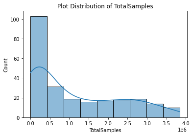
Distribution Plot on Total Number of samples, negative cases and positive cases


Plot line graph- TotalSamples, Positive cases and Negative cases with respect to Date


Correlation
